Showing posts with label DigiPack. Show all posts

Monday, 10 February 2014

DigiPak Printed


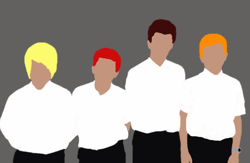
After adding the finishing touches to my developed Digipak I printed it out to ensure it was what I wanted it to look like and it is safe to say I am pleased with the result. Compared to my other digipak I prefer this so much more. In my opinion the colours and design are more likely to be seen with an indie band. I feel that if I had to develop it any further maybe I would think about putting an image on the front but at the same time it could be the case that it would be far too much to look at if I did so. My Digipak doesn't have any proper band photographs only silhouettes but in my opinion I feel this is okay considering the genre. I feel like they wouldn't be trying to sell their image only their music.

Monday, 3 February 2014

DigiPack

In an attempt to improve my digipak this is what I have created. I have changed the background and used the text as a way of representing the name of the album. The typography and the colour scheme of it help represent the creativity yet at the same with it against the black background it kind of brings
in the indie genre. It is simple without tones of pictures but I feel it is effective.

Thursday, 30 January 2014

DigiPak and Poster to show on Thursday


This is the poster and the digipak I designed to show the class ready for feedback on Thursday. My feedback was that it felt a bit childish and really didn't help represent the indie genre of music at all. I wished to make it colourful and creative to go with the feel of the music video and name but now I have taken in the feedback I can understand where the points came from. I created the background myself to try and gain a sense of tie dye or paint splatters but I feel like it maybe does look too childlike. I feel like the silhouettes make it kind of child like also. Another comment was that I need to think more into the layout and what goes where I didn't take this into consideration either.

What I need to do next in order to improve will be to change the colour scheme of it, maybe play around with more darker colours. I want to play around with the opacity of the text so I can layer up different colours on a one colour background. Maybe that will help represent the title of the album too. The digipak as as a whole seems a little empty and so I plan on trying to fill out the panels more.

Other things I will need to consider and include will be the spine and the more information on the poster.

Monday, 13 January 2014

DigiPack Images


In today's lesson we went on a hunt for guys to photograph. Our intentions were to get guys older and more similar looking to our band members but we had to make do with these guys we found. Even though they weren't what we were looking for we took them to Photoshop to make do with their silhouettes. I feel like these images can definitly be used on my digipak. I like the fact you can identify each member but you cant see their face in my opinion this will make the digipak seem more about the music rather then selling the band image.

Thursday, 5 December 2013

DigiPak Backgrounds.

For my digipack I have created these backgrounds on photo shop. I have made them all blended and swirly as I wanted to swirl my images into them so they blend in with the back ground. The background I really want to keep is the bluey grey one as I feel this colour helps represents the band more.


Typography


Whilst presenting to the class I asked their feedback on the typography they preferred. The majority of the class chose the bottom one as it came across a lot neater and looked much more professional. This will now be the typography I will take on when improving on my digipack.

Monday, 2 December 2013

Digipak Feedback


This is the feedback I got for my digipak. The things I need to do now I have this feedback includes changing the background I have created and changing the colours. I need photograph more of the band members and finally I need to play around with the panels changing what I put where and making sure it doesn't promote one song more then the whole album.

Tuesday, 5 November 2013

Digipak Presentation


This is my presentation to give to the class next Monday so I can receive feedback from the class n my plans for my Digipak.

Tuesday, 22 October 2013

DigiPak preperation

I have decided in my Digipak I would like to have a plain bright white background so the colours which are on it stand out especially the bright play dough balls I want scattered around the digipak and so I
went out and brought some play-dough so I can start creating things for the digipak very soon.

Monday, 21 October 2013

Track Listing

In today's lesson our group thought about what we need to do in the future and also we thought about our track listings. We sat down at the table and discussed our future plans and what we need to do in order to get together our individual digipaks.