Monday, 10 February 2014
Print Advert
This is the print poster I have created after gaining the feedback from last Thursday. I have made sure the poster and digipak has similar aspects and even though I prefer my digipak I do think its not overly bad. I feel maybe it is a little text heavy and there isn't much to look at but I feel like the colours work and by looking at the poster you can tell what the digi will look like.
DigiPak Printed
After adding the finishing touches to my developed Digipak I printed it out to ensure it was what I wanted it to look like and it is safe to say I am pleased with the result. Compared to my other digipak I prefer this so much more. In my opinion the colours and design are more likely to be seen with an indie band. I feel that if I had to develop it any further maybe I would think about putting an image on the front but at the same time it could be the case that it would be far too much to look at if I did so. My Digipak doesn't have any proper band photographs only silhouettes but in my opinion I feel this is okay considering the genre. I feel like they wouldn't be trying to sell their image only their music.
Thursday, 6 February 2014
Editing
After we filmed on Tuesday we decided to take a head start on the editing process as it is incredibly time consuming. We had many issues today including the images being saved as CR2 files which weren't recognised by final cut pro. this made the editing process last even longer due to the fact they all had to be saved individually as JPEG's and with 300+ photos needing to be converted we lost a lot of time. Even though it took a while to finally edit these scenes we had filmed the results are worth it and we are all pleased with these individual scenes.
Filming
In today's lesson we took to the music room to attempt to get a few filler scenes filmed for our Music Video. Part of the feedback we received once the music video was shown to the class was that they wanted to see more and so we literally have been trying to film as much as we can to keep the Music Video looking interesting. Other scenes we need to film are a couple with the men but also we need to film more with the actual band as that is our closing scene. We should be done on time if we stick to what we have to film and when and if it keeps going to plan. The scenes we shot today included a microphone getting wrapped up but a head phone lead, two head phones going head to head and a part of the drums slowly moving up and down. These scenes which don't include the men will be just before we have a shot of the actual band playing in the music area.
Monday, 3 February 2014
DigiPack
In an attempt to improve my digipak this is what I have created. I have changed the background and used the text as a way of representing the name of the album. The typography and the colour scheme of it help represent the creativity yet at the same with it against the black background it kind of brings
in the indie genre. It is simple without tones of pictures but I feel it is effective.
in the indie genre. It is simple without tones of pictures but I feel it is effective.
Thursday, 30 January 2014
DigiPak and Poster to show on Thursday
This is the poster and the digipak I designed to show the class ready for feedback on Thursday. My feedback was that it felt a bit childish and really didn't help represent the indie genre of music at all. I wished to make it colourful and creative to go with the feel of the music video and name but now I have taken in the feedback I can understand where the points came from. I created the background myself to try and gain a sense of tie dye or paint splatters but I feel like it maybe does look too childlike. I feel like the silhouettes make it kind of child like also. Another comment was that I need to think more into the layout and what goes where I didn't take this into consideration either.
What I need to do next in order to improve will be to change the colour scheme of it, maybe play around with more darker colours. I want to play around with the opacity of the text so I can layer up different colours on a one colour background. Maybe that will help represent the title of the album too. The digipak as as a whole seems a little empty and so I plan on trying to fill out the panels more.
Other things I will need to consider and include will be the spine and the more information on the poster.
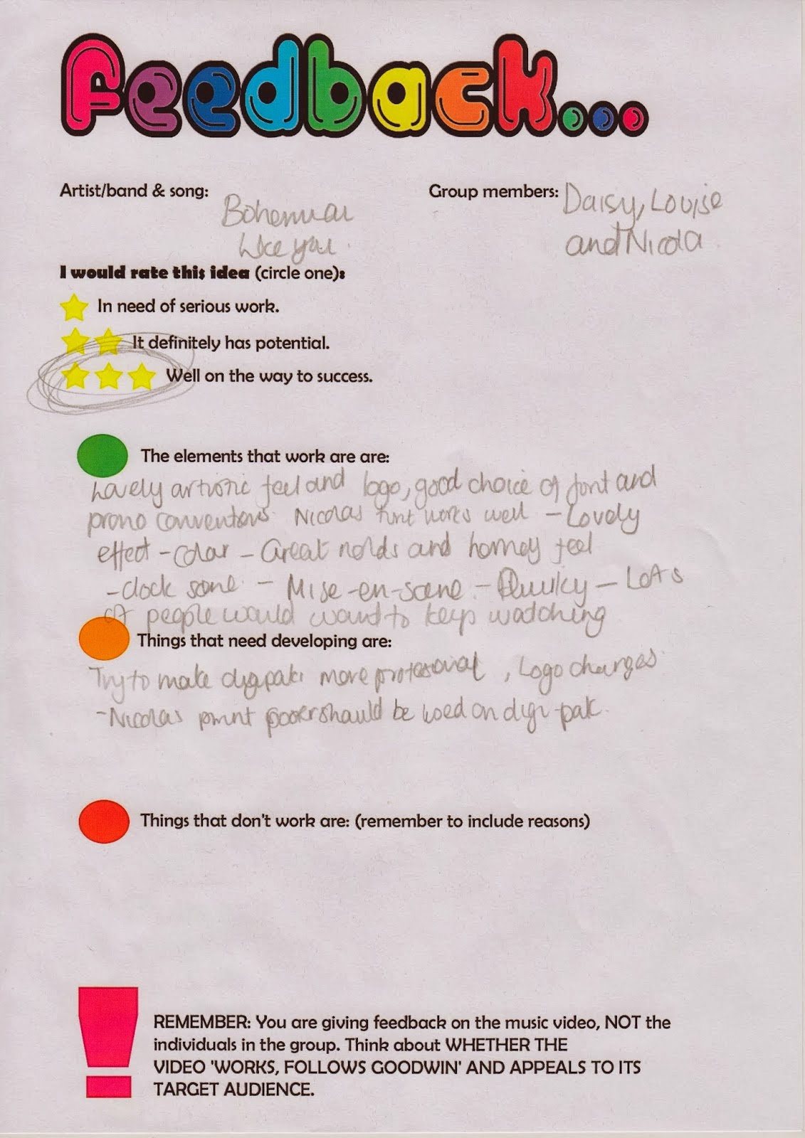
Feedback - First Screening
The feedback we gained through the first screening of our Music Video and Prints media was both good and bad. All the feedback was well received and meant that we now have plenty to work on and improve before the due date. I am able to understand the comments on the Music Video and i agree with everything that was said but now one of my main focuses will be the print media. My problem was that it did represent the indie genre although i tried hard to add colour consider the name of the album'Colour Spectrum' and the creativity of the Music Video. I plan on keeping different colours but toning it down and maybe add some less vibrant colours to represent the genre.
Subscribe to:
Comments (Atom)


