Today we took to re-filiming the car scene. After editing the first time we felt it needed tot be much more professional looking as the other one moved to fast and was incredibly shaky. This time we ensured the camera stayed still and that we moved the cars slower leaving it to look much smoother once edited. A reason as to why this is a key scene for us is the fact that we wish to bring Goodwins music video theory into our Music Video. One of the key conventions is intertextual referencing which is what our video was lacking. Since we have an indie band we wanted them to reflect on the coolness of being British we wanted to insert a reference which would be easily recognisable as it can be assumed people who listen to this style of music will be able to identify The Italian Job reference. In order to do this we decided to re-shoot the car scene and turn it into a mini car chase scene, using mini coopers to reference the italian job.
An issue we found we were having was with the models and how they were starting to fall apart considering how much we had to move them. They were originally put together with cocktail sticks but as a way we are going to over come this problem we plan on pulling them apart and building them up with wire leaving them much more flexible then before.
Monday 23 December 2013
Monday 9 December 2013
Poster Sketches
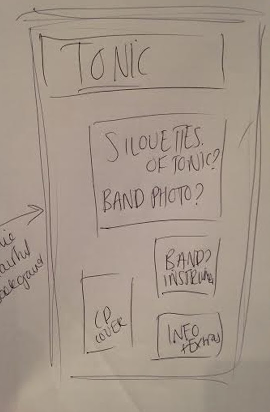
I thought to get started I should do a couple of rough sketches to see the lay out and get some ideas for my poster down onto paper. Im not sure what my favourite is as I feel I would probably have to play around on photoshop to see how the colours turn out like. I do know that I want it to be like my Digipack though, very creative and full of colour.
Researching into existing print posters
Album Posters Analysis from daisymae96
I have briefly looked into existing posters to get a rough idea on what mine should look like.
I have briefly looked into existing posters to get a rough idea on what mine should look like.
Thursday 5 December 2013
Digipack Presentation
This is the presentation I plan on showing to the class to gain feedback on what needs to be done and what is looking good.
DigiPak Backgrounds.
For my digipack I have created these backgrounds on photo shop. I have made them all blended and swirly as I wanted to swirl my images into them so they blend in with the back ground. The background I really want to keep is the bluey grey one as I feel this colour helps represents the band more.
Typography
Whilst presenting to the class I asked their feedback on the typography they preferred. The majority of the class chose the bottom one as it came across a lot neater and looked much more professional. This will now be the typography I will take on when improving on my digipack.
Monday 2 December 2013
Digipak Feedback
This is the feedback I got for my digipak. The things I need to do now I have this feedback includes changing the background I have created and changing the colours. I need photograph more of the band members and finally I need to play around with the panels changing what I put where and making sure it doesn't promote one song more then the whole album.
Subscribe to:
Posts (Atom)


